

In about the time you can finish your morning cup of coffee, there are some universally-effective things you can do to have a better website.
5 Tips to Have a Better Website:
1. No More “Learn More” Buttons
One of the biggest (and quickest) fixes to have a better website is to add an action button. People visit websites because they’re looking for something. Help them take a step beyond looking by placing a button or two where you’d like them to interact with the site. Make sure your button is as clear as possible, so visitors will know where they’re going next. Saying “Learn More” on a button does not tell the visitor what to expect when they click the button. Make sure it takes almost no brainpower to understand your call to action button. Your church is incredible, project that confidence!
Extra points if you make it stand out like this:


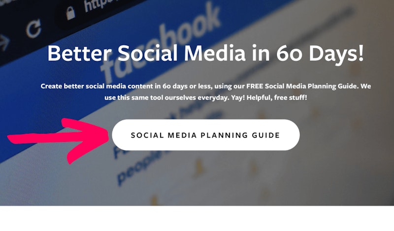
2. Give Your Knowledge Away
Website visitors typically want to understand what your church is about as fast as possible. What separates your church from others? What story is your church trying to live out in your community? Why would a person find a home at your church and not another? Make sure you have clear answers to these questions (and if you don’t, the book Building a StoryBrand by Donald Miller is a great place to start). Once you have the answers, place that information in a one-page flyer or PDF that website visitors can click to download. You will be amazed at the difference preemptively giving information can make!
Here’s a good example:

3. Keep it to “Z”
Even the best wording on a website cannot overcome one big problem: the layout. Studies consistently show when the human eye looks at a website, it scans the content in a “Z” pattern. To have a better website line up the content on your homepage within the “Z” to minimize information overload. You’ll be glad you did!
For example:


4. Stop Hyper Scrolls!
Nothing makes visitors leave a web page or scroll down on their phone faster than this widespread website mistake: having a scrolling picture gallery that rapidly switches from picture to picture. There’s an easy fix for this: